やる気のないパンツ。
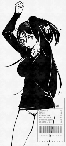
漫画書く時に毎回ベタ部分をどう処理したら良いのか悩む。線が見えなくなるのが嫌でパキッとベタを入れるのが下手なので。上記のイラストは漫画らしくベタと白線使えてて気に入ってる。今後はこういう風にベタを使いたい。私の絵柄に合ってるのかはよく分からない。
トーン使うの本当は好きじゃないけど楽なので頼ってしまう。敗北者。
予定していた同人誌の通販、3月中に用意できないので4月までにはどうにかします。伸ばしグセよくない…。
やる気のないパンツ。
漫画書く時に毎回ベタ部分をどう処理したら良いのか悩む。線が見えなくなるのが嫌でパキッとベタを入れるのが下手なので。上記のイラストは漫画らしくベタと白線使えてて気に入ってる。今後はこういう風にベタを使いたい。私の絵柄に合ってるのかはよく分からない。
トーン使うの本当は好きじゃないけど楽なので頼ってしまう。敗北者。
予定していた同人誌の通販、3月中に用意できないので4月までにはどうにかします。伸ばしグセよくない…。